In this post I'm going to show you a few graphs from a UK government department, and explain what they mean for future UK oil and gas production.
The Department of Energy and Climate Change has recently published the 2011 Digest of UK Energy Statistics (DUKES), which is a fairly lengthy document. Of particular interest is the 'internet booklet' version, which includes the graphs I'll show you in a moment. A bit of background first...
When an oil or gas field is discovered and developed, production initially rises, then reaches a peak, and finally falls away. The rate at which production falls tends to drop over time, so you end up with a 'long tail' of low production that can carry on for many years - or until the field's owner decides it is no longer generating enough income to be worth maintaining. However, this pattern has changed in the past couple of decades, as explained by this quote from the DUKES internet booklet:
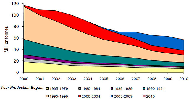
It can be seen from the production chart that during the 2000s the amount of oil produced from older established fields was in general decline. It is also noticeable that the decline in post 1994 developments is greater than in earlier developments. This is because later technology meant crude oil could be extracted at a relatively greater rate leading to a quicker exhaustion of the reserves. In 2010, these newer (post 1994) fields accounted for 69 per cent of the UK’s oil production.Here's the chart it is referring to, showing oil production, with fields grouped by the year they started production (all charts can be clicked to view a larger version):
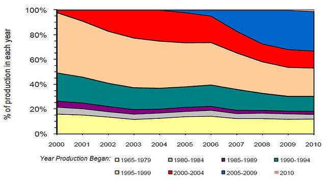
The older fields had new technology applied as it became available, maintaining steady but lower production over longer periods of time, but the newer fields have had all the advanced technology applied very quickly (to make money faster), and as a result the production rises quickly, but also falls quickly once peak production is passed. This has allowed the rather small oil fields discovered in the past couple of decades to offset the slow decline from the much larger, older fields, but now that some of them are declining, and declining fast, there is really nowhere left to turn other than importing oil (the UK has been a net importer since 2005). The following chart shows the same data, but as percentage share of total production:
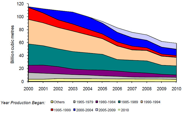
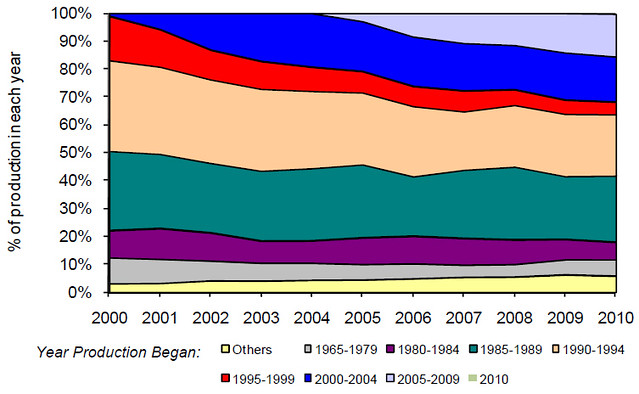
And just to complete the picture, here's the same graphs for gas fields (bear in mind that in 2010 over 40% of our electricity was generated by burning gas...):
Ever played a game of Snakes and Ladders? I think the UK is half way down a snake...
Mike
No comments:
Post a Comment